Powell—Studio
powell-studio.com
Published
12 May 2023Style
Type
Credits
Design: Powell—Studio/@brijanp Development: @neundex
Credits
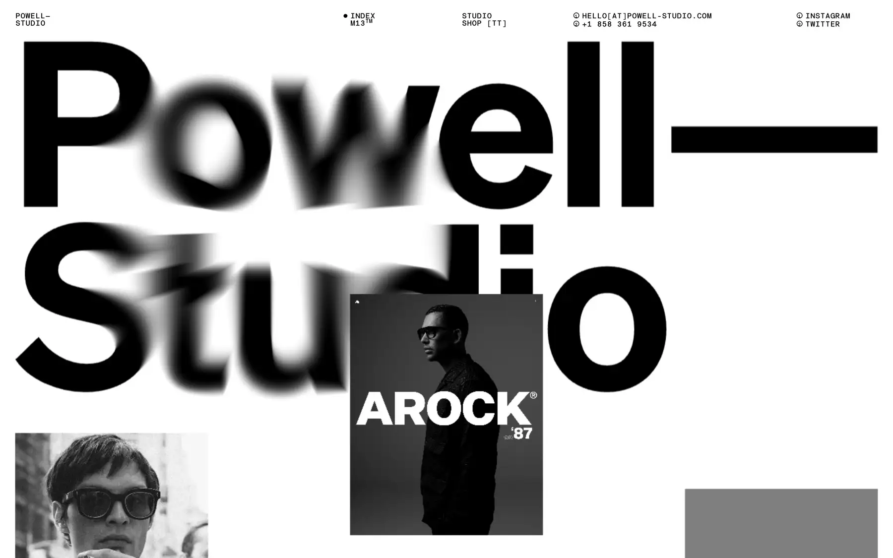
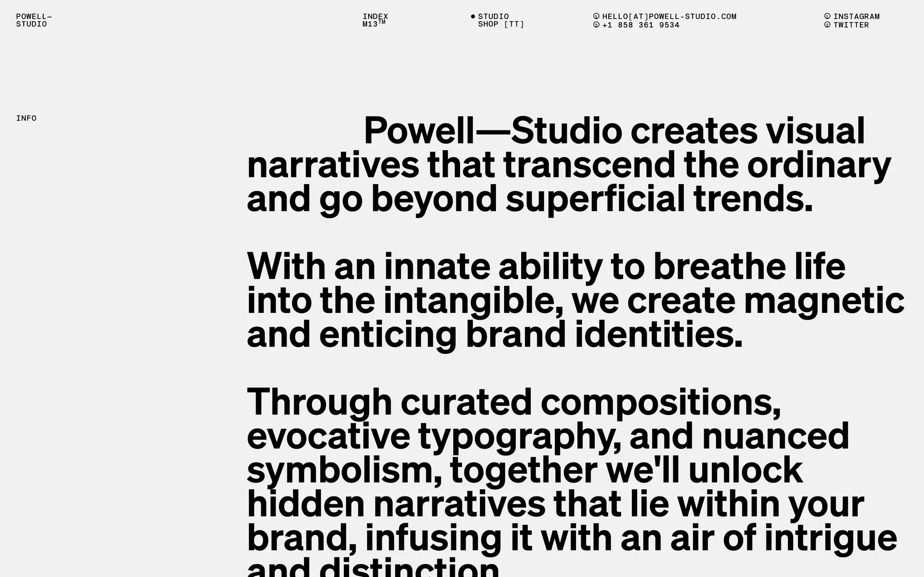
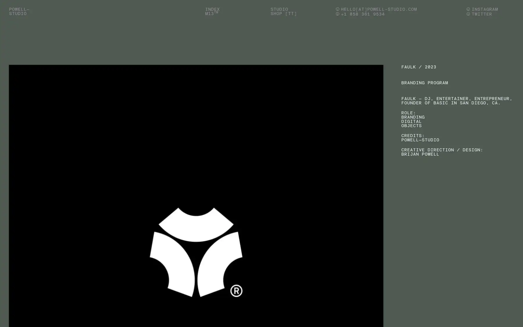
This design studio portfolio site finds a balance between getting out of the way to let the work speak for itself and showing off a bit. The large type blurs as you interact with it, and images warp and stretch as you scroll. There are only two type styles used — a large, bold, humanist sans serif, and a small all-uppercase monospaced font. (I’m not counting the hero text on the home page.)
The eight column grid is interesting because the gutters between columns are relatively wide, two maybe two and half times wider than the outside margins. This narrow margin pushes the content close to edges of the screen giving the header the feel of annotations on a blueprint or structural diagram, while the wide gutter leaves breathing space. A really lovely little detail on the studio page is the way the first line text indent exactly matches the grid columns.


