Kokopako
kokopako.fr
Published
26 May 2023Style
Type
Credits
@kokopako, with code by Florian Morel and Robin Payot
Credits
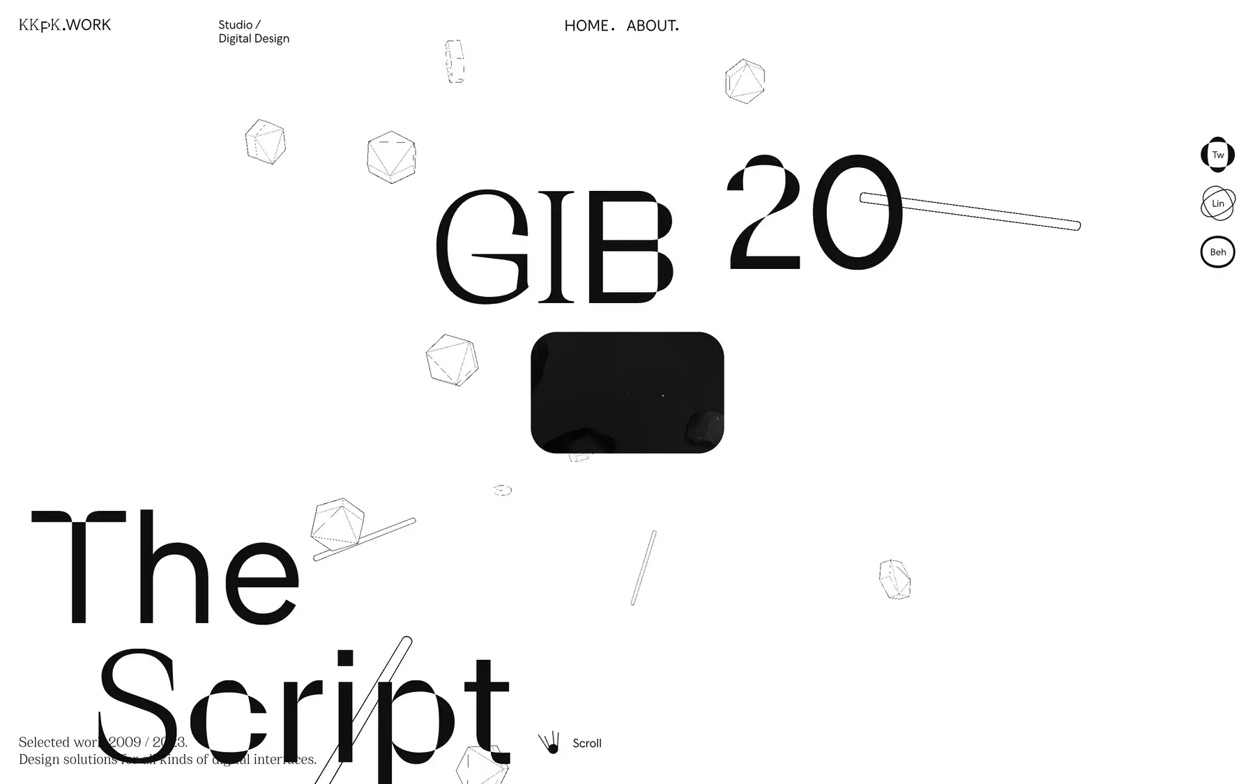
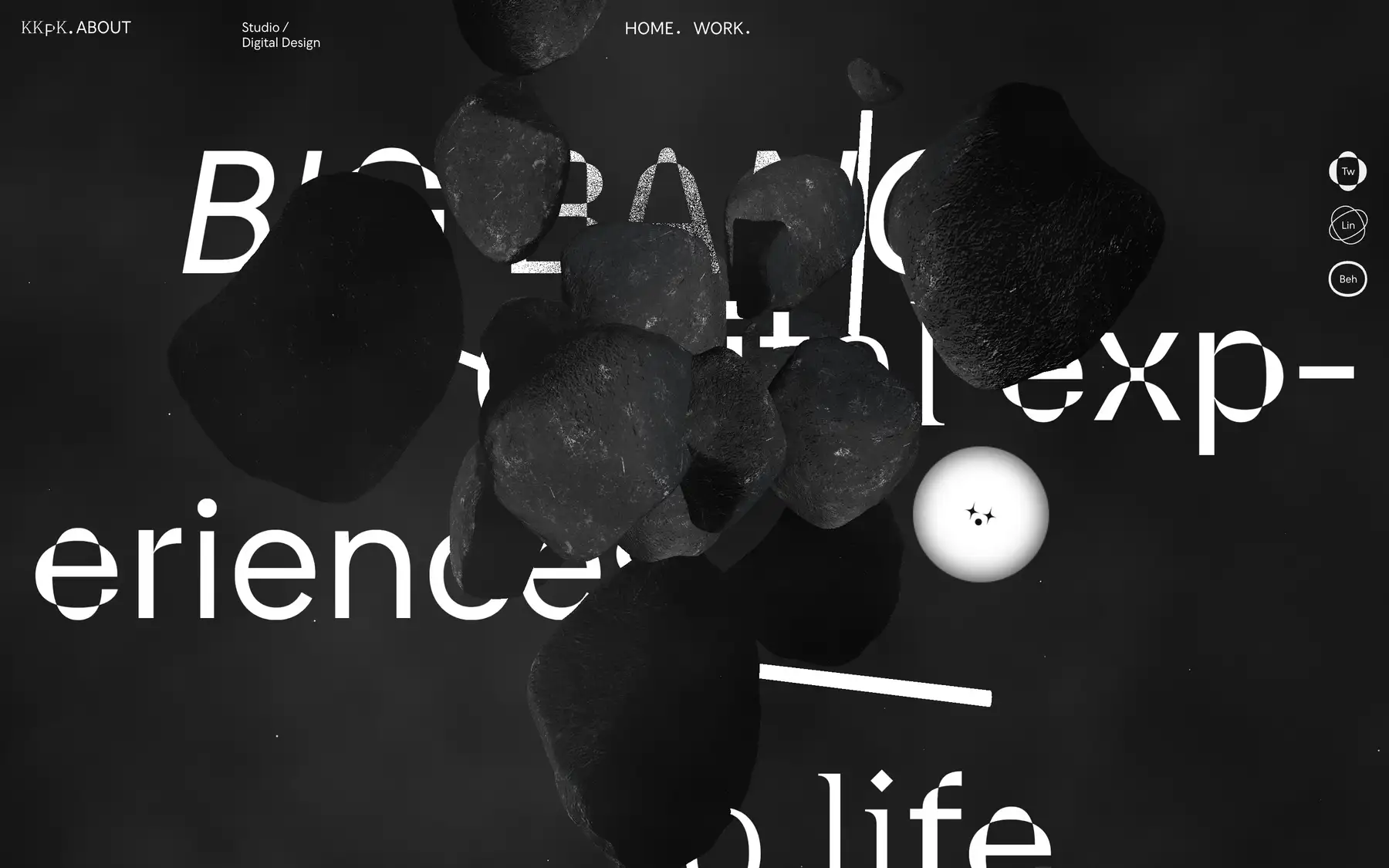
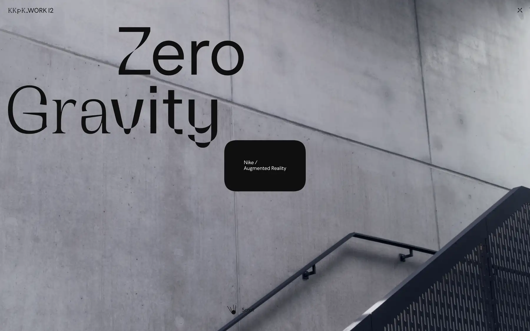
This portfolio website for a digital design studio features 3D scroll-based interactions, a highly unique typeface, and impressive visual effects.
Kokopako are going for an immerse, bold, not-typical website experience. They’re pushing the boundaries of the web, technically and conceptually. If it feels like it breaks some conventions… well, that’s kind of the point. Lighthouse performance score? Terrible. Dropping frames on my brand new MacBook? Sure is! Navigation bugs? Yep. But again, it’s not about that. This kind of website exists when there’s a need to build a unique experience and damn the consequences. I think the takeaway for us designers is to not judge this based on what’s appropriate in our typical projects and instead to consider our audience and decide what’s appropriate. If the wow-factor end of the spectrum is right (and the consequences are bearable) then so be it.

